
Work / Freight
Arrive Logistics
The load board looked like an Excel sheet from another era. Carriers managing hundreds of loads needed answers during high-pressure calls—not another tab to hunt through.
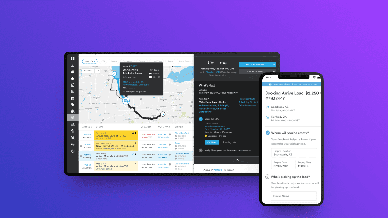
The challenge
Arrive’s load board felt like a spreadsheet. For carriers switching between countless tabs, the dense tables made it hard to locate a specific shipment while a customer was on the phone.
I started with stakeholder interviews, then dozens of wireframes and flow maps. A carrier’s workflow touches multiple systems and constant context-switching—I needed that process before I could improve it.
The breakthrough was shadowing carriers on real calls. What they said they needed and what they actually did were different. They’d name one feature as important, then repeatedly use a workaround for something else. Because the work is desktop-heavy, I broke from mobile-first and designed for the screen they live on. Each revision went through testing with real carriers.
The solution
The new load board is modular. Information hierarchy came from those shadowing sessions: the data that drives a decision is scannable first; secondary detail stays available without drowning the page.
Related information is grouped to the carrier’s decision flow, so they switch tabs less. Contrast, spacing, and type create information zones—no more relying on grid lines. Different carriers have slightly different workflows; the system flexes without getting cluttered.
Carriers can process loads faster at peak. Cognitive load dropped, so they can stay in the customer conversation instead of fighting the UI.